URBAN BIKE PROJECT
The mark embraces activity and movement with its dynamic linework and simplistic forms. I envisioned the Urban Bike Project, a non-profit in Wilmington, Delaware, adopting this mark for its branding and implementing it into its advertising system. The meaning behind the mark represents four traits that reflect my identity: balance, energy, empathy, and technology. I synthesized these traits into a single and unified mark. Breaking down the complexity of my previous iterations, I focused on refining the curves and negative space of the mark. Throughout the process, the mark evolved into a distinctive graphic element.
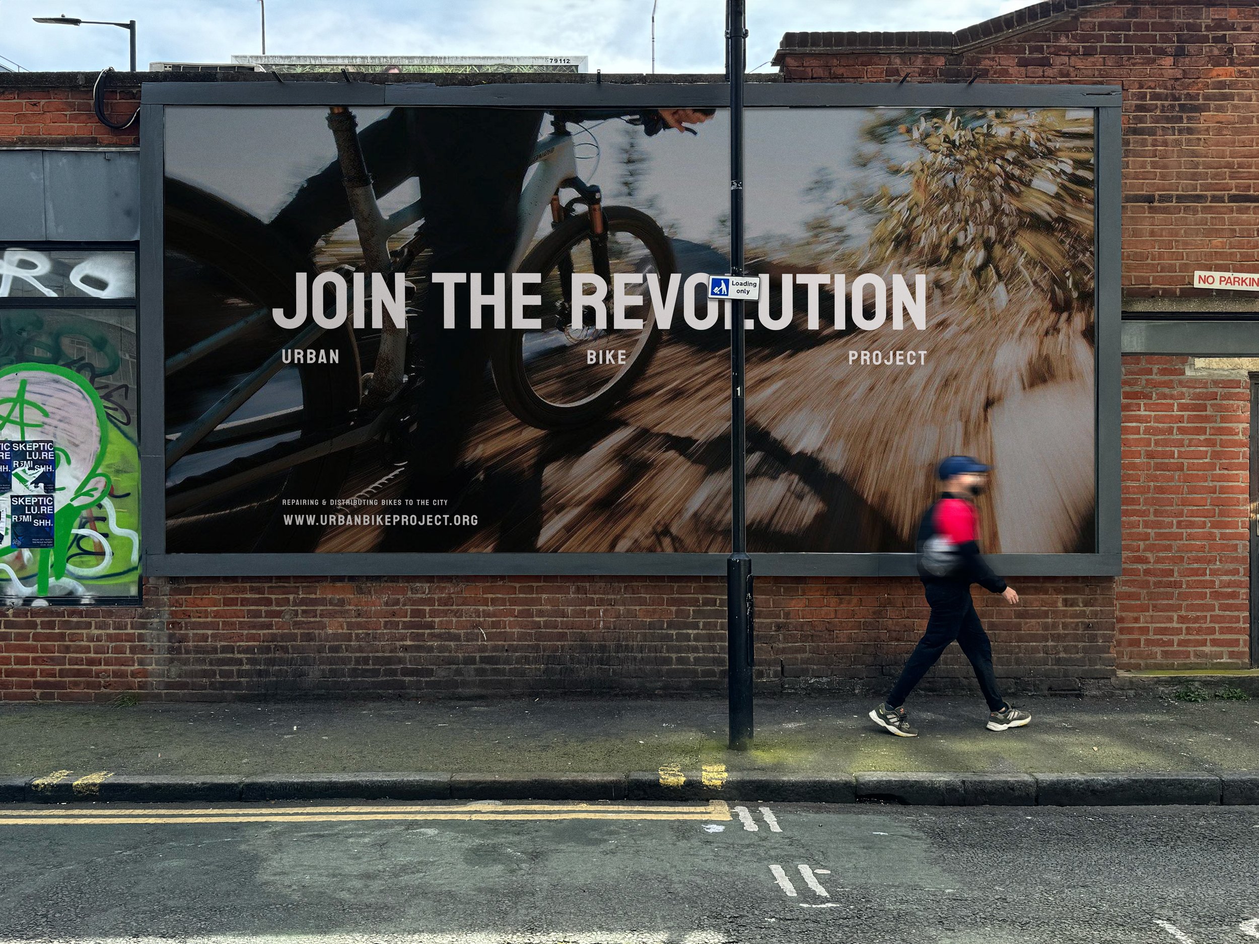
Urban Bike Project is a non-profit community outreach shop serving the needs of Wilmington, Delaware, residents with accessible transportation means. UBP saw how most city residents struggle to find transportation to their jobs, schools, and homes. UBP’s mission is to restore, repair, and recycle bicycles for city residents to ride. UBP consists of a developed brand strategy and identity that focuses on its mission and values to promote riding bicycles as a practical means of transportation. The designed mark visualizes the active motion of a cyclist paired with a bold, well-defined typeface, contextual imagery, and an additional set of touch points that complete its overall identity.